New Zealand

Regions and Cities at a Glance provides a comprehensive assessment of how regions and cities across the OECD are progressing in a number of aspects connected to economic development, health, well-being and the net zero-carbon transition. It presents indicators on individual regions and cities to assess disparities within countries and their evolution since the turn of the new millennium. Each indicator is illustrated by graphs and maps. The report covers all OECD countries and, where data is available, partner countries and economies.
The data in this note reflect different sub-national geographic levels in OECD countries:
Regions are classified on two territorial levels reflecting the administrative organisation of countries: large regions (TL2) and small regions (TL3). Small regions are classified according to their access to metropolitan areas (Fadic et al. 2019).
Functional urban areas consist of cities – defined as densely populated local units with at least 50 000 inhabitants – and adjacent local units connected to the city (commuting zones) in terms of commuting flows (Dijkstra, Poelman, and Veneri 2019). Metropolitan areas refer to functional urban areas above 250 000 inhabitants.
In addition, some indicators use the degree of urbanisation classification (OECD et al. 2021), which defines three types of areas:
- Cities consist of contiguous grid cells that have a density of at least 1 500 inhabitants per km2 or are at least 50% built up, with a population of at least 50 000.
- Towns and semi-dense areas consist of contiguous grid cells with a density of at least 300 inhabitants per km2 and are at least 3% built up, with a total population of at least 5 000.
- Rural areas are cells that do not belong to a city or a town and semi-dense area. Most of these have a density below 300 inhabitants per km2.
Disclaimer: https://oecdcode.org/disclaimers/territories.html
Regional economic trends
Employment and unemployment rates in regions
In New Zealand, regional disparities in unemployment rates are moderate compared to other OECD countries. While in Gisborne 4.3% of the working force was unemployed in 2022Q2, the share was 1.8% in Hawke’s Bay and Taranaki.
Meanwhile, the difference in employment rate between the regions with the highest (Wellington) and lowest (Northland) employment rates reached 10 percentage points in 2022.
Note: Harmonised employment and unemployment rates, aged 15 and over. The OECD median corresponds to the median employment rate in large regions.
Source: OECD (2022), “Short-term regional statistics”, OECD Regional Statistics (database)
The first year of COVID-19 on GDP per capita
The first year of COVID-19 resulted in a decrease in GDP per capita in most New Zealand regions. Taranaki, a region with a GDP per capita 11% above the national average (43 332 vs. 39 166 USD PPP), experienced the largest decrease in GDP among New Zealand regions, of approximately -8%.
Note: GDP per capita is measured in constant prices and constant PPPs, reference year 2015. Constant prices are calculated using national deflators. The OECD median corresponds to the median decline in GDP per capita observed across OECD large regions over the period.
Source: OECD (2022), “Regional economy”, OECD Regional Statistics (database)
Trends in regional economic disparities in the last decade
Differences between New Zealand regions in terms of GDP per capita have remained relatively stable over the past nine years, with the richest 20% of regions reporting a GDP per capita 1.5 times higher than the poorest 20% of regions.
Note: The GDP per capita of the top and bottom 20% regions are defined as those with the highest/lowest GDP per capita until the equivalent of 20% of the national population is reached. A ratio of 2 means the richest regions have a GDP per capita twice as large as the poorest regions. The indicator is calculated using large regions, except for Latvia and Estonia, where small regions are used instead. Irish GDP underwent an upwards revision in 2016. Care is advised in its interpretation.
Source: OECD (2022), “Regional economy”, OECD Regional Statistics (database)
Productivity trends in the last decade
Between 2010 and 2018, Canterbury and Taranaki experienced the highest and lowest productivity growth in New Zealand, respectively. Canterbury saw a labour productivity increase of 1.3% per year, above the OECD average of 0.9%1. During the same period, Taranaki experienced a decline in measured labour productivity, averaging -3.0% per year.
Note: Regional Gross Value Added (GVA) per worker, in USD, constant prices, constant PPP, base year 2015.
Source: OECD (2022), “Regional economy”, OECD Regional Statistics (database)
Well-being, liveability and inclusion in regions
Regional well-being
New Zealand faces stark regional disparities across eight well-being dimensions, with the starkest disparities in terms of health, safety and access to services.
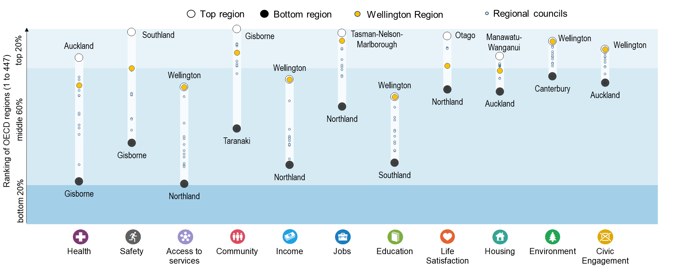
Note: Regional indices provide a first comparative glance of well-being in OECD regions. The figure shows the relative ranking of the regions with the best and worst outcomes in the eleven well-being dimensions, relative to all OECD regions. The eleven dimensions are ordered by decreasing regional disparities in the country. Each well-being dimension is measured by the indicators in the table below.
Relative to other OECD regions, New Zealand performs best in the environment dimension, with most of New Zealand regions lying in the top 20% of OECD regions.
The top 20% of New Zealand regions rank above the OECD median region in 13 out of 14 well-being indicators, performing best in terms of rooms per person and voter turnout in the last national election (prior to 2022).
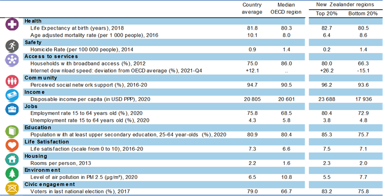
Note: Regional well-being indices are affected by the availability and comparability of regional data across OECD countries. The indicators used to create the indices can therefore vary across OECD publications as new information becomes available. For more visuals, visit https://www.oecdregionalwellbeing.org.
The digital divide
Fixed Internet connections in New Zealand cities and rural areas deliver speeds significantly faster than the OECD average (21% and 38%, respectively). This gap (17 percentage points) is larger than in most other OECD countries.
Note: Cities and rural areas are identified according to the degree of urbanisation (OECD et al. 2021). Internet speed measurements are based on speed tests performed by users around the globe via the Ookla Speedtest platform. As such, data may be subject to testing biases (e.g. fast connections being tested more frequently), or to strategic testing by ISPs in specific markets to boost averages. For a more comprehensive picture of Internet quality and connectivity across places, see OECD (2022), “Broadband networks of the future”.
Source: OECD calculations based on Speedtest by Ookla Global Fixed and Mobile Network Performance Maps for 2020Q4.
The average speed of fixed Internet connections is above the OECD average in 3 out of 14 New Zealand regions. Within the country, residents of Auckland, Wellington and Canterbury experience the fastest connections.
Demographic trends in regions and cities
Dependency rate
The elderly dependency rate2 in New Zealand is also higher than the OECD average (26.8 %) in most regions, ranging from 36.7% in West Coast to 19% in Auckland.
Population in cities
Between 2010 and 2021, all cities in New Zealand experienced a rise in population. Population growth ranged from 0.7% per year in Invercargill to 2.0% per year in Tauranga.
Note: Cities refer to functional urban areas (Dijkstra, Poelman, and Veneri 2019). Population counts for the functional urban area are estimated from administrative regional data (TL3 regions, OECD regional database), using the population distribution from population grids.
Over the past decade, the population has grown the most in New Zealand cities with 100 000 to 250 000 inhabitants. Cities with 250 000 to 1.5 million inhabitants have seen their population grow, on average, but to a lesser extent.
Environmental challenges in regions and cities
Greenhouse gas emissions in regions
Since 1990, production-based greenhouse gas emissions have increased in all New Zealand regions. Northland (46%) and Hawke’s Bay (4%) experienced the largest and lowest increase in emissions, respectively.
On average, New Zealand regions increased their emissions by 0.70% per year between 1990 and 2018. This is below the 2.63% yearly reduction rate needed to reach the New Zealand target of a 50% reduction in emissions by 2030, with respect to 2005 levels.
Note: Bubbles are proportional to per capita greenhouse gas emissions, not to the overall level of greenhouse gas emissions in the region.
Source: OECD calculations, based on the Emissions Database for Global Atmospheric Research (European Commission. Joint Research Centre. 2019).
In 2018, greenhouse gas emissions per capita in New Zealand were largest in Southland, Taranaki and West Coast. Agriculture accounts for the largest share of greenhouse gas emissions in the three regions.
Note: Regions with low population counts may rank high in greenhouse gas emissions per capita while contributing relatively little to overall emissions in the country.
Urban heat island effect
In New Zealand cities, the difference in temperature between cities and their surrounding areas (i.e. urban heat island intensity) reaches 3.3 degrees Celsius (°C). The largest effect is observed in Palmerston North and Rotorua, two cities that are, on average, 5.4°C warmer than their surrounding areas.
Note: The Urban Heat Island Intensity (UHI) index is defined as the difference in land surface temperature between built-up areas and non-built-up areas within functional urban areas. This index can be affected by the type of vegetation and climate in non-built-up areas.
Source: OECD calculations, based on land surface temperature data from NASA’s Moderate Resolution Imaging Spectroradiometer (MODIS) (Wan, Hook, and Hulley 2021a, 2021b)
References
Source of administrative boundaries: © OECD, © EuroGeographics, National Statistical Offices, © UN-FAO Global Administrative Unit Layers (GAUL)
Footnotes
International comparability in 2019 and 2020 is limited because of methodological differences in the calculation of employment counts during the height of the COVID-19 economic crisis.↩︎
The elderly dependency rate compares the number of elderly people at an age when they are generally economically inactive (i.e. aged 65 and over), to the number of people of working age (i.e. 15-64 years old).↩︎