Israel

Regions and Cities at a Glance provides a comprehensive assessment of how regions and cities across the OECD are progressing in a number of aspects connected to economic development, health, well-being and the net zero-carbon transition. It presents indicators on individual regions and cities to assess disparities within countries and their evolution since the turn of the new millennium. Each indicator is illustrated by graphs and maps. The report covers all OECD countries and, where data is available, partner countries and economies.
The data in this note reflect different sub-national geographic levels in OECD countries:
Regions are classified on two territorial levels reflecting the administrative organisation of countries: large regions (TL2) and small regions (TL3). Small regions are classified according to their access to metropolitan areas (Fadic et al. 2019).
Functional urban areas consist of cities – defined as densely populated local units with at least 50 000 inhabitants – and adjacent local units connected to the city (commuting zones) in terms of commuting flows (Dijkstra, Poelman, and Veneri 2019). Metropolitan areas refer to functional urban areas above 250 000 inhabitants.
In addition, some indicators use the degree of urbanisation classification (OECD et al. 2021), which defines three types of areas:
- Cities consist of contiguous grid cells that have a density of at least 1 500 inhabitants per km2 or are at least 50% built up, with a population of at least 50 000.
- Towns and semi-dense areas consist of contiguous grid cells with a density of at least 300 inhabitants per km2 and are at least 3% built up, with a total population of at least 5 000.
- Rural areas are cells that do not belong to a city or a town and semi-dense area. Most of these have a density below 300 inhabitants per km2.
Disclaimer: https://oecdcode.org/disclaimers/territories.html
Regional economic trends
Employment and unemployment rates in regions
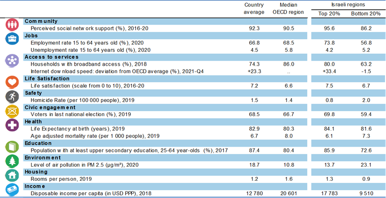
In Israel, regional disparities in unemployment rates are moderate compared to other OECD countries. While in Jerusalem District 4.7% of the working force was unemployed in 2022Q2, the share was 2.6% in Central District and Tel Aviv District.
Meanwhile, the difference in employment rate between the regions with the highest (Central District and Tel Aviv District) and lowest (Jerusalem District) employment rates reached 2 percentage points in 2022.
Note: Harmonised employment and unemployment rates, aged 15 and over. The OECD median corresponds to the median employment rate in large regions.
Source: OECD (2022), “Short-term regional statistics”, OECD Regional Statistics (database)
Well-being, liveability and inclusion in regions
Regional well-being
Israel faces stark regional disparities across ten well-being dimensions, with the starkest disparities in terms of community, jobs and access to services.
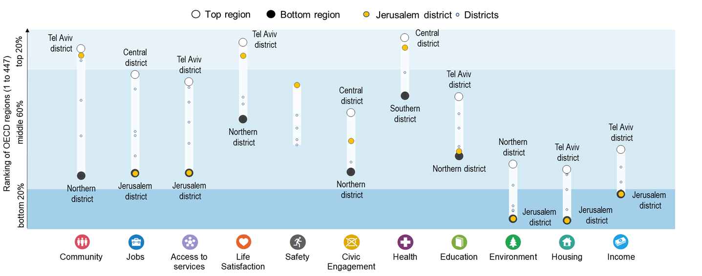
Note: Regional indices provide a first comparative glance of well-being in OECD regions. The figure shows the relative ranking of the regions with the best and worst outcomes in the eleven well-being dimensions, relative to all OECD regions. The eleven dimensions are ordered by decreasing regional disparities in the country. Each well-being dimension is measured by the indicators in the table below.
Relative to other OECD regions, Israel performs best in the health dimension, with two thirds of of Israeli regions lying in the top 20% of OECD regions.
The top 20% of Israeli regions rank above the OECD median region in 10 out of 14 well-being indicators, performing best in terms of life satisfaction and employment rate.
Note: Regional well-being indices are affected by the availability and comparability of regional data across OECD countries. The indicators used to create the indices can therefore vary across OECD publications as new information becomes available. For more visuals, visit https://www.oecdregionalwellbeing.org.
The digital divide
Fixed Internet connections in Israeli cities and rural areas deliver speeds significantly faster than the OECD average (20% and 18%, respectively). This gap (2 percentage points) is smaller than in most other OECD countries.
Note: Cities and rural areas are identified according to the degree of urbanisation (OECD et al. 2021). Internet speed measurements are based on speed tests performed by users around the globe via the Ookla Speedtest platform. As such, data may be subject to testing biases (e.g. fast connections being tested more frequently), or to strategic testing by ISPs in specific markets to boost averages. For a more comprehensive picture of Internet quality and connectivity across places, see OECD (2022), “Broadband networks of the future”.
Source: OECD calculations based on Speedtest by Ookla Global Fixed and Mobile Network Performance Maps for 2020Q4.
The average speed of fixed Internet connections is above the OECD average in 4 out of 6 Israeli regions. Within the country, residents of Central District, Tel Aviv District and Southern District experience the fastest connections.
Relative poverty rates
In Israel, relative poverty rates1 range from 13% to 43% across regions. This 30 percentage point difference is more pronounced than the average difference observed across the 29 OECD countries with available data (16 percentage points), placing Israel among the five countries with the starkest regional disparities in the OECD.
Note: The OECD median gives the median relative poverty rate observed in a sample made of 326 large regions (from 28 countries), and 28 small regions (from Denmark, Lithuania and the Slovak Republic). Data corresponds to 2020 or the latest available year.
Demographic trends in regions and cities
Dependency rate
The elderly dependency rate2 in Israel is also lower than the OECD average (25.3 %) in all regions, ranging from 25.6% in Tel Aviv District to 15% in Northern District.
Environmental challenges in regions and cities
Greenhouse gas emissions in regions
Since 1990, production-based greenhouse gas emissions have increased in all Israeli regions. Jerusalem District (144%) and Northern District (58%) experienced the largest and lowest increase in emissions, respectively.
Note: Bubbles are proportional to per capita greenhouse gas emissions, not to the overall level of greenhouse gas emissions in the region.
Source: OECD calculations, based on the Emissions Database for Global Atmospheric Research (European Commission. Joint Research Centre. 2019).
In 2018, greenhouse gas emissions per capita in Israel were largest in Southern District, Haifa District and Jerusalem District. Power accounts for the largest share of greenhouse gas emissions in the three regions.
Note: Regions with low population counts may rank high in greenhouse gas emissions per capita while contributing relatively little to overall emissions in the country.
References
Source of administrative boundaries: © OECD, © EuroGeographics, National Statistical Offices, © UN-FAO Global Administrative Unit Layers (GAUL)
Footnotes
The relative poverty rate gives the share of people – as a % of the regional population – with an income below the relative poverty line (60% of the national median income).↩︎
The elderly dependency rate compares the number of elderly people at an age when they are generally economically inactive (i.e. aged 65 and over), to the number of people of working age (i.e. 15-64 years old).↩︎